
Analyzing Twitter data using Python

Previously in this series, we’ve focused on processing the obtained data and extracting features. We’ve also briefly touched on topics related to Natural Language Processing and tried to derive sentiments from tweets.
We’re now going to look at ways to analyze and present the data we’ve extracted. This post will conclude our series regarding Twitter data exploration using Python.
Geo-locating tweets using location
The first interesting way to look at tweets is to better understand the audience that produced them. One step in that direction is to identify what places where they originate from. Now, one of the columns from the dataset we can use is the user’s declared location. Let’s review what it contains.
We’re looking at the 50 most common declared user locations for our dataset. It needs a little mapping exercise first.
locs = df['user.location'].value_counts()
locs[locs>=10]
Locations occurring at least 10 times in our dataset
We’re going to map these entries so we can group similar entries.
mapping = {'London' : 'London, UK',
 'London, England': 'London, UK'  ,
 'United Kingdom' : 'United Kingdom',
 'England, United Kingdom': 'England' ,
 'UK': 'United Kingdom',
 'England': 'England',
 'Europe' : 'Europe' ,
 'South East, England': 'South East England',
 'Scotland, United Kingdom' : 'Scotland',
 'Scotland': 'Scotland',
 'Ireland' : 'Ireland',
 'North West, England' : 'North West England',
 'London, UK': 'London, UK',
 'Manchester, England': 'Manchester, UK',
 'European Union': 'European Union',
 'North East, England': 'North East England',
 'Glasgow, Scotland': 'Glasgow, UK',
 'London ': 'London',
 'European Union 🇪🇺' : 'European Union',
 'Wales, United Kingdom': 'Wales',
 'Rutland': 'Rutland, UK',
The mapping dictionary that we created
We’re going to replace locations with the mapped entries:
df['user.location'] = df['user.location'].apply(lambda x: mapping[x] if x in mapping.keys() else x )Here’s how the locations will look now.
locs = df['user.location'].value_counts()
locs = locs[locs >= 10]
locs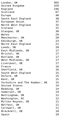
Locations after processing
Here’s where the Geolocator comes in. Geolocator? Yes. That’s the tool that given a location (be it the full address or just the city name) can identify a real-world location and provide some extra details such as latitude and longitude, which we’ll need for our later mapping exercise. We’re going to use the Nominatim package which will allow us to get the coordinates of the above cities.
from geopy.geocoders import Nominatim
geolocator = Nominatim(user_agent='twitter-analysis-cl')
#note that user_agent is a random name
locs = list(locs.index) #keep only the city names
We’re going to use the geolocate function to return the location of each of the provided place.
geolocated = list(map(lambda x: [x,geolocator.geocode(x)[1] if geolocator.geocode(x) else None],locs))
geolocated = pd.DataFrame(geolocated)
geolocated.columns = ['locat','latlong']
geolocated['lat'] = geolocated.latlong.apply(lambda x: x[0])
geolocated['lon'] = geolocated.latlong.apply(lambda x: x[1])
geolocated.drop('latlong',axis=1, inplace=True)
Here’s what the output looks like. We’ll use it as a lookup table.

Plotting on a map
Given we now have a lookup table to use for looking up locations and their coordinates, let’s join it with our data. Let’s also group by location and obtain the count occurrences once again.
mapdata = pd.merge(df,geolocated, how='inner', left_on='user.location', right_on='locat')locations = mapdata.groupby(by=['locat','lat','lon'])\
       .count()['created_at']\
.sort_values(ascending=False)locations.head(10)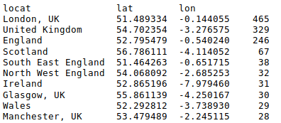
Time for a map. We’ll use Matplotlib and Cartopy to display our data. In this simple example, we’re going to plot individual locations (can be seen as red dots on the map), as well as blue circles whose radius varies by how many tweets came from that particular place.
We’ve also set a helper function to compute how big the circle should be — the idea is to have the size of the circle increase much slower than the number it wants to represent, otherwise the smaller entries won’t be visible at all.
First, set up general settings for Matplotlib.
import matplotlib.pyplot as pltplt.style.use('fivethirtyeight')
plt.rcParams.update({'font.size': 20})
plt.rcParams['figure.figsize'] = (20, 10)
Now, generate the map.
import cartopy.crs as ccrs
from matplotlib.patches import Circleax = plt.axes(projection=ccrs.PlateCarree())
ax.stock_img()# plot individual locations
ax.plot(mapdata.lon, mapdata.lat, 'ro', transform=ccrs.PlateCarree())# add coastlines for reference
ax.coastlines(resolution='50m')
ax.set_global()
ax.set_extent([20, -20, 45,60])def get_radius(freq):
    if freq < 50:
        return 0.5
    elif freq < 200:
        return 1.2
    elif freq < 1000:
        return 1.8# plot count of tweets per location
for i,x in locations.iteritems():
    ax.add_patch(Circle(xy=[i[2], i[1]], radius=get_radius(x), color='blue', alpha=0.6, transform=ccrs.PlateCarree()))
plt.show()
The output of our code. Brexit is a very UK-centered issue.
Further analysis using charts
Let’s continue exploring our data using the power of Matplotlib. Remember the sentiment score we computed? Let’s plot it.

The sentiment in the tweets we’re looking at is skewed towards negative
Let’s say we want to display this in a friendlier way. We’ll now transform it into a categorical variable. This will cut our data into four bins of data, with more friendly values (being levels of a categorical variable).
sent_clasification = pd.cut(df['sentiment_score'],\
          [-3,-1.2, 0, 1.2 , 3],\
          right=True,\
          include_lowest=True,\
          labels=['strongly negative', 'negative', 'positive', 'strongly positive'])
sent_clasification.value_counts()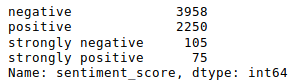
Results

Let’s try plotting them one more time — same information but from a different perspective.
Another way to look at this data is one of the most recognizable (and hated) ways to represent data: pie charts. Not a big fan of it myself, but let’s give it a try.
plt.figure(figsize=(10,7)) #make it smaller this time
sent_clasification.value_counts().plot(kind='pie')
plt.grid(False)
plt.tight_layout()
Word Cloud
What about a word cloud? Can it depict the chaos of Brexit in a single image?
from wordcloud import WordCloud, STOPWORDS
bigstring = df['processed_text'].apply(lambda x: ' '.join(x)).str.cat(sep=' ')plt.figure(figsize=(12,12))
wordcloud = WordCloud(stopwords=STOPWORDS,
                          background_color='white',
                          collocations=False,
                          width=1200,
                          height=1000
                         ).generate(bigstring)
plt.axis('off')
plt.imshow(wordcloud)
The output of our Word Cloud efforts
Hash Tags
Interested in the Top 10 hashtags? We’re going to use regular expressions to extract them and then count occurrences.
import re
hashtags = df['text'].apply(lambda x: pd.value_counts(re.findall('(#\w+)', x.lower() )))\
                     .sum(axis=0)\
                     .to_frame()
                     .reset_index()\
                     .sort_values(by=0,ascending=False)
hashtags.columns = ['hashtag','occurences']hashtags.head(10)
hashtags[:10].plot(kind='bar',y='occurences',x='hashtag')
plt.tight_layout()
plt.grid(False)
plt.suptitle('Top 10 Hashtags for keyword: Brexit, language: English', fontsize=14)
Users Mentioned
Let’s do the same for users mentioned in tweets. They’re easy to be spotted by the @ sign.
plt.grid(False)
plt.tight_layout()
plt.suptitle('Top 10 Users for keyword: BREXIT, locale: EN', fontsize=14)df['text'].str\
          .findall('(@[A-Za-z0-9]+)')\
          .apply(lambda x: pd.value_counts(x))\
          .sum(axis=0)\
          .sort_values(ascending=False)[:10]\
          .plot(kind='bar')
No surprises here really
Top Words
Let’s now look at the top 10 most used words. The order of action is as follows:
-
drop rows with no data
-
use regular expressions to extract words
-
count word usage and sum them app
-
sort
import re
words = df['processed_text'].dropna()\
                            .apply(lambda y: pd.value_counts(re.findall('([\s]\w+[\s])',' '.join(y))))\
                            .sum(axis=0)\
                            .to_frame()\
                            .reset_index()\
                            .sort_values(by=0,ascending=False)
words.columns = ['word','occurences']words.head(10)

Top 10 words used
Bigrams
Another thing we should look at are bigrams — a sequence of two words, commonly found together. There’s also trigrams (for three-word sequences) if you’re asking.
from nltk import bigrams
bigramseries = pd.Series([word for sublist in df['processed_text'].dropna()\
                    .apply(lambda x: [i for i in bigrams(x)])\
                    .tolist() for word in sublist])\
.value_counts()bigrams.head(10)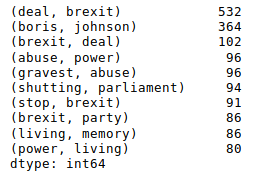
plt.suptitle('Top 10 Bigrams for keyword: BREXIT, locale: EN', fontsize=18)
bigramseries[:10].plot(kind='bar')
Conclusion
This post concludes our series about exploring Twitter data with Python. While it wasn’t supposed to be an exhaustive list of what you can do with it, it was meant to give the reader a glimpse into the sheer possibilities the Python toolkit gives about extracting, processing and presenting data. It’s straightforward, well-documented and downright fun. The full Jupyter Notebook for this series is available here.
Thank you for reading and feel free to share some examples of your own.